快速提示:使用偽選擇器樣式化表單元素
自從 CSS 被發明以來,各地的 Web 開發人員都希望有一種方法來設置內置瀏覽器控件的樣式。這對於像按鈕和文本輸入這樣的簡單元素來說很簡單,但對於像 select 這樣的一些更複雜的元素來說卻很困難 和 range .在這個快速提示中,我們將向您展示如何操作。
為什麼要使用偽選擇器?
目前還沒有自定義內置瀏覽器元素外觀的標準方法。例如,搜索輸入顯示一個小“x”女巫,您可以按此取消搜索。這是在內部作為一個單獨的元素實現的,但是您無法使用常規 CSS 來實現它。瀏覽器製造商已經註意到了,他們已經添加了您可以使用的供應商特定選擇器。對於那個“x”,要使用的選擇器是 input[type=search]::-webkit-search-cancel-button .
這裡有一個巨大的已知選擇器列表。所有瀏覽器都提供了一些用於自定義內置元素的選擇器,但壞消息是支持無處不在。希望將來會有一個標準來為這種混亂帶來一致性。不過現在,我們必須分別針對每個瀏覽器。
如果您使用 Google Chrome,有一種簡單的方法可以找出您應該使用的選擇器。啟用 Shadow DOM 支持後,您可以看到內置瀏覽器元素的內部結構。以下是如何做到這一點,摘自我們的 Chrome DevTools 提示和技巧文章:
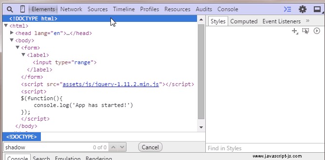
打開開發人員工具並轉到設置。那裡,在常規 ,在元素下 檢查 顯示用戶代理影子 DOM。 現在,當您檢查元素時,您將看到它們的#shadow-root。當您在#shadow-root 中選擇一個元素時,在樣式選項卡中,您將看到用戶代理樣式表使用哪些選擇器來設置它們的樣式。大多數情況下,這是您正在尋找的選擇器。
請記住,以下大多數實驗僅適用於 Chrome 和 Safari。 Firefox 和 IE 不支持自定義內置元素所需的許多偽選擇器,因此它們顯示常規版本。有一天,當我們制定了標準時,這樣的定制將無處不在。
1。複選框
CSS 中的複選框除了給它們一個寬度和高度外,沒有什麼可以做的。但是 Chrome 和 Safari 支持 :before 和 :after 輸入上的偽元素,因此您可以獲得一些樂趣。請注意,複選標記完全使用 CSS 製作,甚至帶有淡入淡出的動畫效果。
通過設置 -webkit-appearance 到 none ,我們阻止應用默認瀏覽器樣式,這為我們的自定義 CSS 敞開了大門。還要感謝 em 單位,我們使用其父級的字體大小製作了複選框。嘗試增加它。
body {
    font: 13px sans-serif;
    color:#444;
}

label {
    padding: 10px;
    display: block;
}

input[type=checkbox].styled {
    -webkit-appearance: none;
    height: 1em;
    position: relative;
    background-color: #276FF4;
    width: 1em;
    border-radius: 3px;
    outline: none;
    font-size: 16px;
    /* try this: */
    /* font-size: 36px; */
    vertical-align: middle;
    box-shadow: 0 1px 1px rgba(0, 0, 0, 0.2);
}

input[type=checkbox].styled:active {
    box-shadow: 0 0 0.8em rgba(0, 0, 0, 0.2) inset;
}

input[type=checkbox].styled:before,
input[type=checkbox].styled:after {
    content: '';
    background-color: inherit;
    position: absolute;
    transition: 0.1s background-color;
}

input[type=checkbox].styled:after {
    width: 0.19em;
    height: 0.65em;
    -webkit-transform: rotate(36deg) translate(0.52em, -0.16em);
}

input[type=checkbox].styled:before {
    width: 0.2em;
    height: 0.4em;
    -webkit-transform: rotate(-58deg) translate(-0.2em, 0.48em);
}

/* We use the checked selector to make the pseudo elements visible */

input[type=checkbox].styled:checked:after,
input[type=checkbox].styled:checked:before {
    background-color: #fff;
}
<label>
<input type="checkbox" /> Regular Checkbox
</label>
<label>
<input type="checkbox" class="styled" />
Styled Checkbox
</label> 2。單選按鈕
我們可以在單選按鈕上使用相同的技術。這裡更簡單,因為我們不需要在 CSS 中打勾。這仍然只適用於 Chrome 和 Safari。其他瀏覽器顯示常規單選按鈕。
body {
    font: 13px sans-serif;
    color:#444;
}

label {
    padding: 10px;
    display: block;
}

input[type=radio].styled {
    -webkit-appearance: none;
    height: 1em;
    position: relative;
    background-color: #276FF4;
    width: 1em;
    border-radius: 50%;
    outline: none;
    font-size: 14px;
    box-shadow: 0 1px 1px rgba(0, 0, 0, 0.2);
}

input[type=radio].styled:checked:before {
    content: '';
    height: 0.4em;
    width: 0.4em;
    background-color: #FFF;
    position: absolute;
    border-radius: 50%;
    top: 0.3em;
    left: 0.3em;
}
<label>
<input type="radio" name="test" /> Regular Radio
</label>
<label>
<input type="radio" class="styled" name="test" /> Styled Radio
</label> 3。選擇元素
眾所周知,選擇元素很難用 CSS 設置樣式。即使在今天,我們也僅限於我們可以改變的東西。要自定義向下箭頭,我們可以使用背景圖像和一些填充。對於下拉列表,您可以在選項元素上指定字體大小和背景,但僅此而已。
body {
    font: 13px sans-serif;
    color:#444;
}

label {
    padding: 10px;
    display: block;
}

select.styled {
    -webkit-appearance: none;
    -moz-appearance: none;
    -ms-appearance: none;
    appearance: none;
    border: 1px solid #aaa;
    padding: 2px 15px 2px 5px;
    background-image: url(data:image/png;base64,iVBORw0KGgoAAAANSUhEUgAAABMAAAAICAQAAACxSAwfAAAAUklEQVQY02P4z0AMRGZGMaShwCisyhITmb8huMzfEhOxKvuvsGAh208Ik+3ngoX/FbBbClcIUcSAw21QhXxfIIrwKAMpfNsEUYRXGVCEFc6CQwBqq4CCCtU4VgAAAABJRU5ErkJggg==), linear-gradient(#EDEDED, #EDEDED 38%, #DEDEDE);
    background-position: right center;
    background-repeat: no-repeat;
    border-radius: 2px;
    box-shadow: 0 1px 1px rgba(0, 0, 0, 0.1);
    color: #333;
}

/* Required to disable the default IE styles */
select.styled::-ms-expand {
    display: none;
}

select.styled:hover {
    border-color: #909090;
}

/* You have limited control on the drop down list. Uncomment this: */
/* select.styled option{
    background-color:green;
    color:#fff;
    font-size:20px;
} */
<label>
    <select>
        <option>Cheeze</option>
        <option>Bacon</option>
        <option>Pasta</option>
        <option>Pizza</option>
        <option>Ice Cream</option>
    </select> Regular Select
</label>

<label>
    <select class="styled">
        <option>Cheeze</option>
        <option>Bacon</option>
        <option>Pasta</option>
        <option>Pizza</option>
        <option>Ice Cream</option>
    </select> Styled Select
</label>
4。範圍元素
Range 是瀏覽器支持的較新的表單元素之一。它也是最可定制的之一。 Chrome、Safari 和 Firefox 都為我們提供了大量的 CSS 偽選擇器,我們可以使用它們來設置元素的特定部分的樣式。甚至 IE 也支持一些,儘管我們沒有在我們的示例中實現它們。請參閱此列表以了解可用的內容。
body {
    font: 13px sans-serif;
    color:#444;
}

label {
    padding: 10px;
    display: block;
}

input[type=range].styled {
    -webkit-appearance: none;
    outline: 0;
    width: 300px;
    transition: 0.2s;
}

/* Chrome */

input[type=range].styled::-webkit-slider-runnable-track {
    height: 2px;
    background: #9DA0A6;
    border: none;
    border-radius: 3px;
}

input[type=range].styled::-webkit-slider-thumb {
    -webkit-appearance: none;
    height: 16px;
    width: 16px;
    border-radius: 50%;
    background: #FFF;
    margin-top: -7px;
    vertical-align: middle;
    border: 5px solid #276FF4;
    transition: 0.15s;
}

input[type=range].styled::-webkit-slider-thumb:active {
    height: 20px;
    width: 20px;
    margin-top: -9px;
}

/* Firefox */

input[type=range].styled::-moz-range-track {
    height: 2px;
    background: #9DA0A6;
    border: none;
    border-radius: 3px;
}

input[type=range].styled::-moz-range-progress {
    background: #276FF4;
}

input[type=range].styled::-moz-range-thumb {
    height: 16px;
    width: 16px;
    border-radius: 50%;
    background: #FFF;
    margin-top: -7px;
    vertical-align: middle;
    border: 5px solid #276FF4;
    transition: 0.15s;
    box-sizing: border-box;
}

input[type=range].styled::-moz-range-thumb:active {
    height: 20px;
    width: 20px;
    margin-top: -9px;
}

input[type=range].styled::-moz-focus-outer {
    border: 0;
}
<label>
<input type="range" /> Regular Range
</label>
<label>
<input type="range" class="styled" /> Styled Range
</label> 5。進度條
進度元素還為我們提供了大量的可定制性。雖然對於這樣一個簡單的元素,您可以輕鬆嵌套兩個 div 並製作自己的版本。
body {
    font: 13px sans-serif;
    color:#444;
}

label {
    padding: 10px;
    display: block;
}

progress.styled {
    margin-top: 15px;
    width: 200px;
    height: 12px;
    background-color: #ddd;
    border: none;
}

/* Chrome */

progress.styled::-webkit-progress-bar {
    background-color: #ddd;
}

progress.styled::-webkit-progress-value {
    background-color: #266FF4;
}

/* Firefox */

progress.styled::-moz-progress-bar {
    background-color: #266FF4;
}
<label>
<progress value="22" max="100"></progress> Regular Progress
</label>
<label>
<progress value="22" max="100" class="styled"></progress> Styled Progress
</label> 結論
很高興我們終於可以修改內置的瀏覽器控件,但是在標準化方面還有很長的路要走。谷歌瀏覽器在這方面是一個明顯的領導者,如果你編寫 Chrome 應用程序或擴展程序,你可以繼續使用我們在這裡展示的所有內容。但如果你想要一致的跨瀏覽器支持,最好的解決方案仍然是依賴 JavaScript 庫和 Chosen 之類的 jQuery 插件。