Colortip - 一個 jQuery 工具提示插件
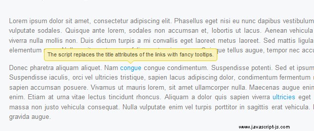
在本教程中,我們將編寫一個簡單的 jQuery 工具提示插件。它將您頁面中元素的標題屬性轉換為一系列豐富多彩的工具提示。有六種顏色主題可供選擇,因此您可以輕鬆地將其與您的其他設計相匹配。
第 1 步 - XHTML
我們今天要寫的插件,通過將頁面上元素的標題轉換為三個跨度的結構,形成一個工具提示,在懸停時顯示。因此,如果您從這樣的常規鏈接開始:
<a href="https://tutorialzine.com/" class="blue" title="Go to Tutorialzine">Tutorialzine</a>jQuery 會將其轉換為您可以在下面看到的標記。
<a class="blue colorTipContainer" href="https://tutorialzine.com/">Tutorialzine
<span class="colorTip" style="margin-left: -60px;">Go to Tutorialzine
<span class="pointyTipShadow"></span>
<span class="pointyTip"></span>
</span>
</a>請注意,上面的第一個代碼塊指定了一個“blue " 類名。這是因為我們覆蓋了提示的默認顏色(黃色)。您可以從 red 中進行選擇 , 藍色 , 綠色 , 黃色 , 白色 和黑色 ,或者您可以在插件樣式表中創建自己的顏色。
禁用 JavaScript 的用戶仍然會在頁面上看到常規的標題工具提示,因此腳本會優雅地降級。
第 2 步 - CSS
要在頁面上顯示彩色提示,您首先需要在 html 文檔的 head 部分中包含插件樣式表文件。
<link rel="stylesheet" type="text/css" href="colortip-1.0/colortip-1.0-jquery.css"/>如果您不想保留單獨的包含文件,您也可以從文件中復製樣式並將它們直接粘貼到主樣式表中。該樣式表定義了工具提示的定位和設計。它帶有六種顏色主題,您可以輕鬆添加更多。
colortip-1.0-jquery.css - 第 1 部分
.colorTipContainer{
    position:relative;
    text-decoration:none !important;
}

.colorTip{
    /* This class is assigned to the color tip span by jQuery */

    display:none;
    position:absolute;
    left:50%;
    top:-30px;
    padding:6px;

    background-color:white;
    font-family:Arial,Helvetica,sans-serif;
    font-size:11px;
    font-style:normal;
    line-height:1;
    text-decoration:none;
    text-align:center;
    text-shadow:0 0 1px white;
    white-space:nowrap;

    -moz-border-radius:4px;
    -webkit-border-radius:4px;
    border-radius:4px;
}

.pointyTip,.pointyTipShadow{
    /* Setting a thick transparent border on a 0x0 div to create a triangle */
    border:6px solid transparent;
    bottom:-12px;
    height:0;
    left:50%;
    margin-left:-6px;
    position:absolute;
    width:0;
}

.pointyTipShadow{
    /* The shadow tip is 1px larger, so it acts as a border to the tip */
    border-width:7px;
    bottom:-14px;
    margin-left:-7px;
}
.colorTipContainer 類被分配給添加了顏色提示的元素。它將它們的位置設置為相對,以便提示可以在它們上方居中。
一個簡潔的 CSS 技巧用於創建三角形的尖尖。如您所知,div 和 span 只能採用矩形(如果應用邊框半徑,則為橢圓/圓角矩形)。但是,如果您將粗邊框應用於 0 x 0 元素,則邊框要適合的唯一方法是在每一側佔據一個三角形空間。然後,通過將默認邊框顏色設置為透明,您可以使四個三角形中的任何一個可見。
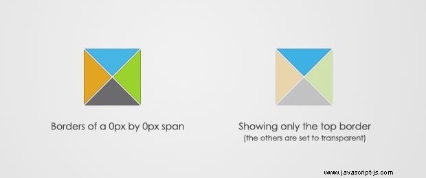
這實際上是在兩個 .pointyTip 上完成的 和 .pointyTipShadow 跨度,以便給人一種尖尖應用了邊框的印象,因此它與顏色提示設計的其餘部分相匹配。現在讓我們仔細看看六種顏色主題。
colortip-1.0-jquery.css - 第 2 部分
/* 6 Available Color Themes */

.white .pointyTip{ border-top-color:white;}
.white .pointyTipShadow{ border-top-color:#ddd;}
.white .colorTip{
    background-color:white;
    border:1px solid #DDDDDD;
    color:#555555;
}

.yellow .pointyTip{ border-top-color:#f9f2ba;}
.yellow .pointyTipShadow{ border-top-color:#e9d315;}
.yellow .colorTip{
    background-color:#f9f2ba;
    border:1px solid #e9d315;
    color:#5b5316;
}

.blue .pointyTip{ border-top-color:#d9f1fb;}
.blue .pointyTipShadow{ border-top-color:#7fcdee;}
.blue .colorTip{
    background-color:#d9f1fb;
    border:1px solid #7fcdee;
    color:#1b475a;
}

.green .pointyTip{ border-top-color:#f2fdf1;}
.green .pointyTipShadow{ border-top-color:#b6e184;}
.green .colorTip{
    background-color:#f2fdf1;
    border:1px solid #b6e184;
    color:#558221;
}

.red .pointyTip{ border-top-color:#bb3b1d;}
.red .pointyTipShadow{ border-top-color:#8f2a0f;}
.red .colorTip{
    background-color:#bb3b1d;
    border:1px solid #8f2a0f;
    color:#fcfcfc;
    text-shadow:none;
}

.black .pointyTip{ border-top-color:#333;}
.black .pointyTipShadow{ border-top-color:#111;}
.black .colorTip{
    background-color:#333;
    border:1px solid #111;
    color:#fcfcfc;
    text-shadow:none;
}
請記住,只有邊框是尖尖的唯一可見部分。您可以按照相同的結構添加自己的顏色主題。
第 3 步 - jQuery
首先,您需要將 jquery 庫和插件文件包含到頁面中,然後我們的 script.js 文件將利用該插件並為頁面上的鏈接添加顏色提示。
<script type="text/javascript" src="http://ajax.googleapis.com/ajax/libs/jquery/1.4.2/jquery.min.js"></script>
<script type="text/javascript" src="colortip-1.0/colortip-1.0-jquery.js"></script>
<script type="text/javascript" src="script.js"></script>
出於性能原因,我將此代碼放在 colortips.html 的底部 文件。這允許在瀏覽器阻止加載 js 文件之前呈現頁面設計。
現在讓我們來看看插件的colortip。
colortip-1.0-jquery.js - 第 1 部分
(function($){
    $.fn.colorTip = function(settings){

        var defaultSettings = {
            color       : 'yellow',
            timeout     : 500
        }

        var supportedColors = ['red','green','blue','white','yellow','black'];

        /* Combining the default settings object with the supplied one */
        settings = $.extend(defaultSettings,settings);

        /*
        *   Looping through all the elements and returning them afterwards.
        *   This will add chainability to the plugin.
        */

        return this.each(function(){

            var elem = $(this);

            // If the title attribute is empty, continue with the next element
            if(!elem.attr('title')) return true;

            // Creating new eventScheduler and Tip objects for this element.
            // (See the class definition at the bottom).

            var scheduleEvent = new eventScheduler();
            var tip = new Tip(elem.attr('title'));

            // Adding the tooltip markup to the element and
            // applying a special class:

            elem.append(tip.generate()).addClass('colorTipContainer');

            // Checking to see whether a supported color has been
            // set as a classname on the element.

            var hasClass = false;
            for(var i=0;i<supportedColors.length;i++)
            {
                if(elem.hasClass(supportedColors[i])){
                    hasClass = true;
                    break;
                }
            }

            // If it has been set, it will override the default color

            if(!hasClass){
                elem.addClass(settings.color);
            }
調用插件時,可以傳遞一個配置對象,該對象保存默認顏色和鼠標離開時工具提示消失的超時時間。
您可以從六種可能的顏色中進行選擇,並將它們作為類名分配給元素。該插件將檢查顏色類是否存在,如果不存在,它將應用您在配置對像中傳遞的默認顏色類。如果您沒有傳遞配置對象,則會使用黃色來代替。
colortip-1.0-jquery.js - 第 2 部分
          // On mouseenter, show the tip, on mouseleave set the
            // tip to be hidden in half a second.

            elem.hover(function(){

                tip.show();

                // If the user moves away and hovers over the tip again,
                // clear the previously set event:

                scheduleEvent.clear();

            },function(){

                // Schedule event actualy sets a timeout (as you can
                // see from the class definition below).

                scheduleEvent.set(function(){
                    tip.hide();
                },settings.timeout);

            });

            // Removing the title attribute, so the regular OS titles are
            // not shown along with the tooltips.

            elem.removeAttr('title');
        });

    }

    /*
    /   Event Scheduler Class Definition
    */

    function eventScheduler(){}

    eventScheduler.prototype = {
        set : function (func,timeout){

            // The set method takes a function and a time period (ms) as
            // parameters, and sets a timeout

            this.timer = setTimeout(func,timeout);
        },
        clear: function(){

            // The clear method clears the timeout

            clearTimeout(this.timer);
        }
    }
在插件代碼的第二部分,我們將事件監聽器綁定到懸停事件(mouseenter 和 mouseleave 事件的組合)。
注意事件調度程序類。它用於設置要在預定時間段後執行的功能。它的核心是調用 setTimeout .一個 clear() 方法也作為類的一部分提供,因此可以銷毀之前安排的事件(當您將鼠標從工具提示上移開然後在它消失之前將其移回時很有用)。
colortip-1.0-jquery.js - 第 3 部分
  /*
    /   Tip Class Definition
    */

    function Tip(txt){
        this.content = txt;
        this.shown = false;
    }

    Tip.prototype = {
        generate: function(){

            // The generate() method returns either a previously generated element
            // stored in the tip variable, or generates and saves it in tip for
            // later use, after which returns it.

            return this.tip || (this.tip = $('<span class="colorTip">'+this.content+
                                             '<span class="pointyTipShadow"></span><span class="pointyTip"></span></span>'));
        },
        show: function(){
            if(this.shown) return;

            // Center the tip and start a fadeIn animation
            this.tip.css('margin-left',-this.tip.outerWidth()/2).fadeIn('fast');
            this.shown = true;
        },
        hide: function(){
            this.tip.fadeOut();
            this.shown = false;
        }
    }

})(jQuery);在代碼的最後一部分,我們定義了小費類。它有一個生成 , 顯示 並隱藏 方法。為每個工具提示創建來自此類的對象。先調用generate方法,tooltip存放在本地this.tip 多變的。 show 和 hide 方法對該變量進行操作以運行淡入/淡出動畫。
現在我們只剩下調用插件並為頁面上的所有鏈接添加顏色提示了。
script.js
$(document).ready(function(){

    /* Adding a colortip to any tag with a title attribute: */

    $('[title]').colorTip({color:'yellow'});

});這裡的配置對像也可以省略,因為黃色無論如何都是默認值。但是您可以為工具提示指定不同的顏色。如果你應用紅色, 綠色, 藍色 , 白色 , 黃色 或 黑色 作為元素的類名,會覆蓋tooltip的設計。
有了這個,我們的 Colortip 插件就完成了!
總結
使用我們今天編寫的插件非常簡單,因為它不需要任何特定配置。它只需要一系列元素並用彩色工具提示替換它們的標題屬性。您還可以輕鬆地創建自己的工具提示設計,只需在樣式表中添加三個額外的樣式類,並向 colortip-1.0-jquery.js 中支持的顏色數組添加一個元素。
你怎麼看?你會如何改進這個插件?